Not every advert you create will need a call to action, but most will.
Ad scent
A call to action must be easy to see and match the page the user is sent to. Here is a banner advert from Offshore Company Formation:

The primary colors in this advert are red and white. Once clicked, we’re directed to their website which also uses the same colors.
In advertising, this is known as an ad scent. When using call to actions, you must analyze the page you’re sending traffic to in order to create the base of your advert. To reach your client’s objective of securing a sale, signing up to their website, or reading a blog post, you need the user to stay on their website once they click the advert. Customers may leave directly after clicking if there is no ad scent (i.e. the experience they see on the website is totally different from the advert banner they viewed).
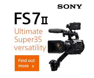
Sony’s banner ads and website have a strong ad scent as they use the same color, font, and white space in both their advert and website:
Squint test
Call to actions should also pass the squint test. The squint test is a simple way to detect whether your call to action stands out or not. To perform the squint test, take three steps away
from your monitor, squint your eyes, and if you cannot clearly spot the call to action button, your call to action needs to be adjusted.
Here’s an Acer advert.

Does it pass your squint test? Nope, ours neither. The entire background is green and it’s hard to identify where the call to action is as nothing in that advert is popping out urging us to click.
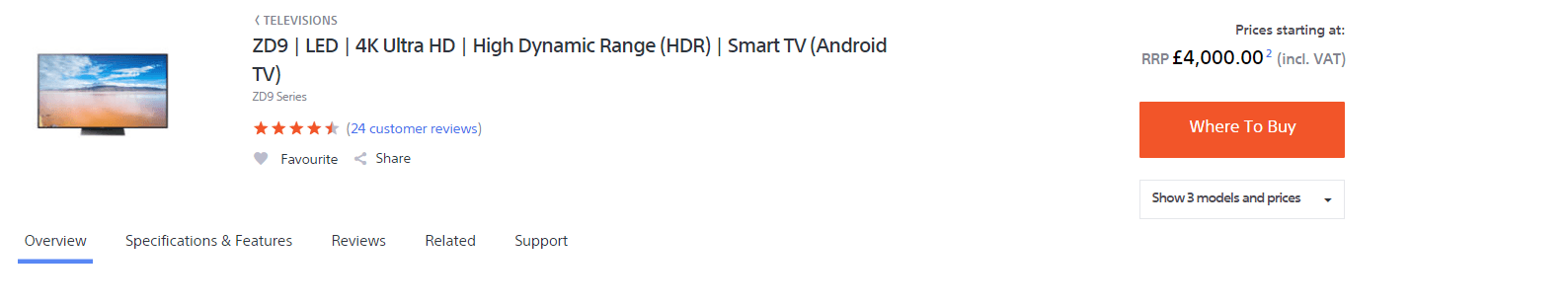
What about Target’s advert leading users to their online shop? Does this pass your squint test?
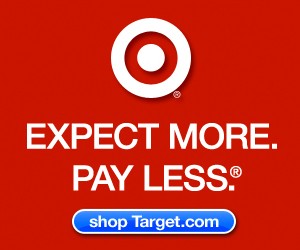
Yes, we can see it too.
To create a clear call to action buttons, ensure it stands out from the background and if possible, use a unique color that hasn’t been used in the image.
Position
Position the button away from the feature image and let it breathe so it can stand out more. Most call to action buttons are directly underneath the image and text, as the customer first consumes the content and is then presented with a decision to click or not.

You will rarely see the call to action button at the top of the advert with the text and image at the bottom or at the left of an image.


Jorrit
Founder Adpiler