There are two things you need to consider when choosing the right colors for your client’s banners: brand colors and color psychology.
Brand colors — these are the colors used by your client on their website, logo, and other marketing materials.
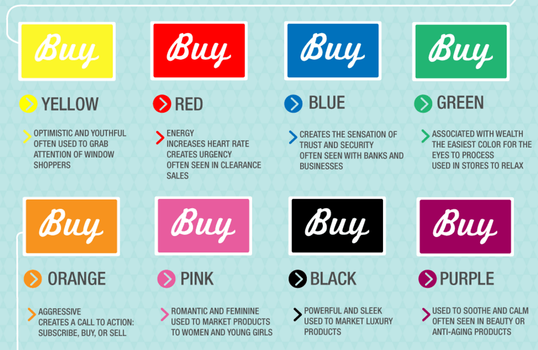
Color psychology — this is the effect certain colors have on our minds; different colors have been proven to evoke various emotions in the human brain:

Argos, whose brand colors are red and white, also plaster their fitness related advert with the color green to further empathize their message of health:

Sticking to their brand colors, Blue Apron are still able convey the message of healthy eating by using relevant images. Argos, whose brand colors are red and white, also plaster their fitness related advert with the color green to further empathize their message of health:


As a designer or agency, should you opt for brand colors or color psychology? There is no right or wrong answer. Look at your client’s past adverts and view the colors and images they used so you can keep their brand consistent across all platforms. This should also be discussed before work begins so you know the parameters that you can work within.
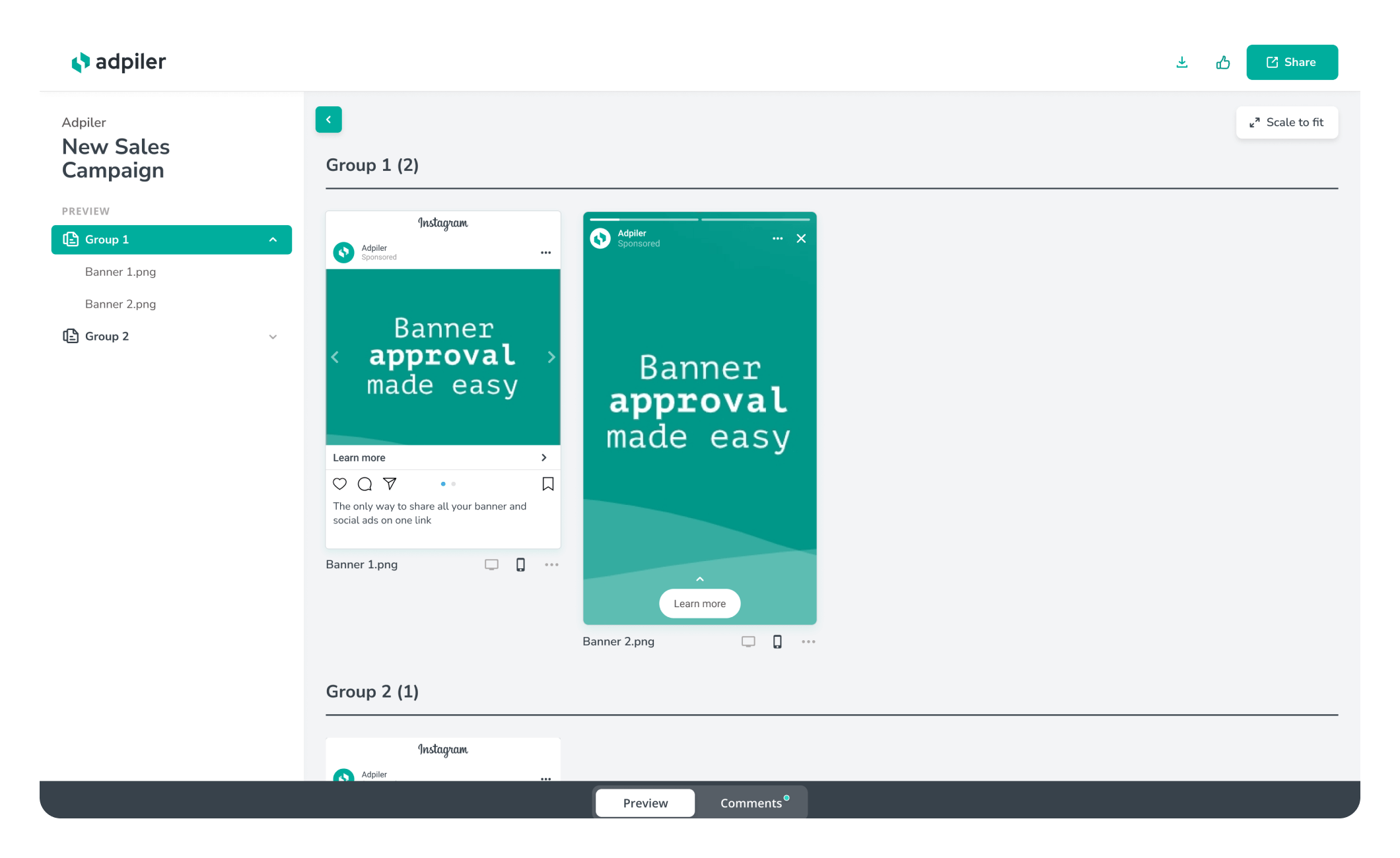
Tip: Using Adpiler, you can show clients two versions of your advert: one using brand colors and the other using color psychology. Clients can view them side by side on a real website and decide which one they prefer.

Jorrit
Founder Adpiler
