Words and images go hand in hand. The image should further emphasize the text and the text should further emphasize the image.
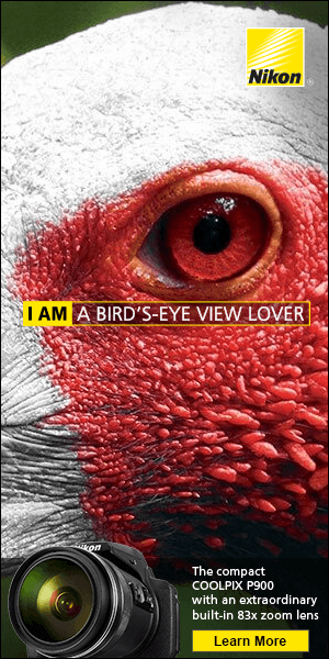
Take this Nikon banner advert as the perfect example.

It uses images and word psychology to portray how powerful their camera is:
Birds are known for their great vision, with many having the ability to see for miles. The text “I am a bird’s-eye view lover” is reinforced with the image of the bird as the focal point of the advert.
At the bottom of the advert is a small call to action, which showcases the camera’s power with a built-in 83x zoom lens.
You can get creative when mixing words with images, and you needn’t limit your image choices to your client’s product range.
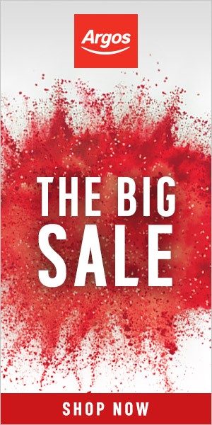
Argos, who were running a huge sale, used the words “THE BIG SALE” with a colorful red explosion in the background:

Notice that when they don’t focus on health, they have gone back to red (brand color) – a color which has also been proven to increase urgency. During the communication stage of your project, ask your client what words they would and would not like mentioned in their adverts.
Certain brands want to retain their hard-to-obtain and luxury status and avoid using words like discount, free, sale, or save. Some may not want you to use cartoon graphics or certain animation effects because it may damage their band.

Jorrit
Founder Adpiler


