We have released a major update to our platform. Since today, you can impress your customers with your responsive ads. Either you use ratio, single-size, or multi-size responsive ads, Adpiler will handle that for you.
IAB released their new ad portfolio with responsive ads last year. Although non-responsive ads give you more control on the design in all dimensions, responsive-ads have shown a steady growth since then.
How to upload responsive ads to Adpiler?

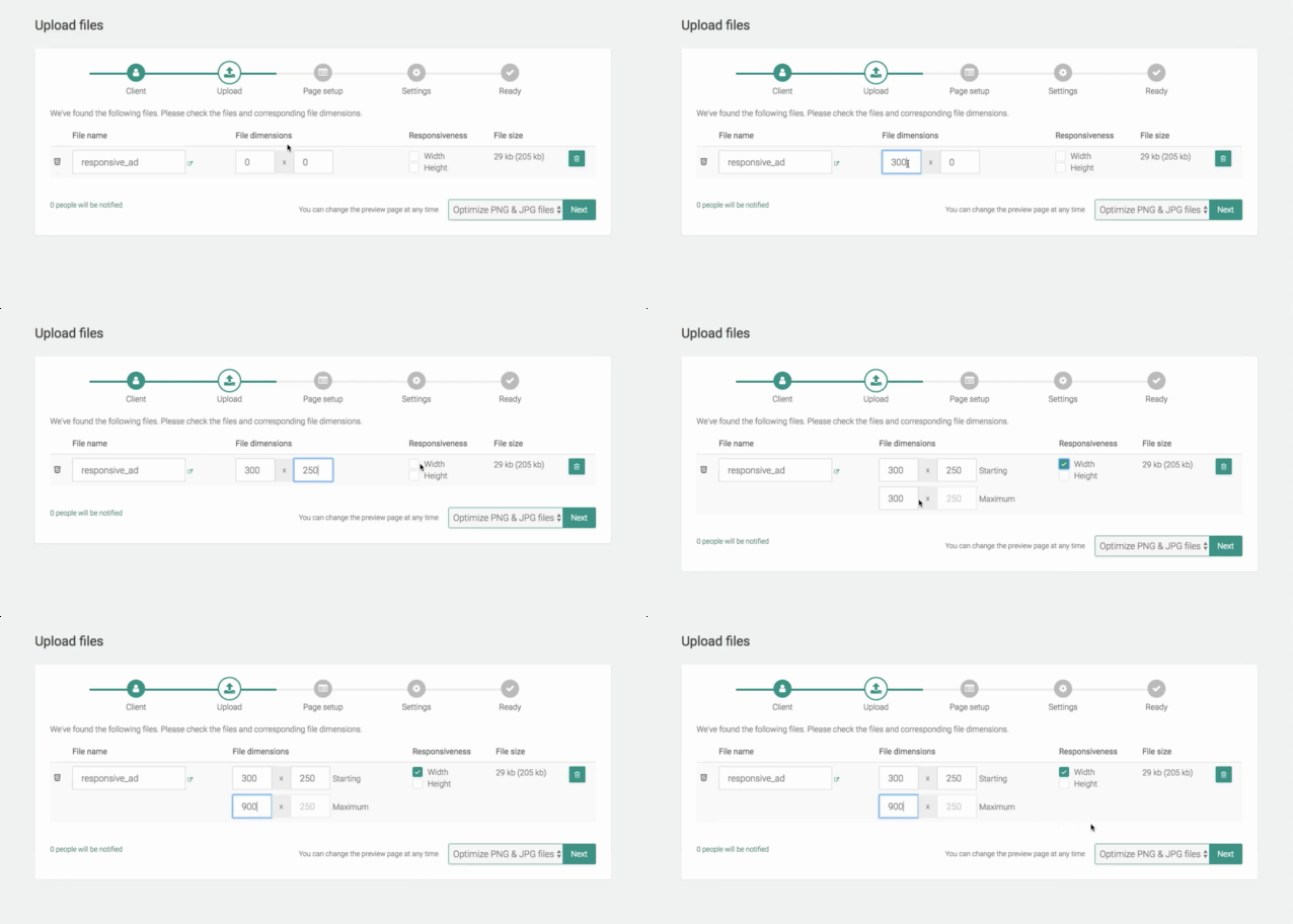
Just drop your responsive ad to our uploader as zip-file, as any other HTML5 ad. In the confirmation screen you will notice the new column ‘Responsiveness’. Checking the ‘width’ and/or ‘height’ checkbox will allow you to add the maximum dimensions of the ad. The Starting dimensions are the dimensions of the ad when the preview page is loaded. The Maximum dimensions mark the size to what the user can resize the ad.
How do responsive ads behave on the preview pages?
Here’s where the magic comes in 😉

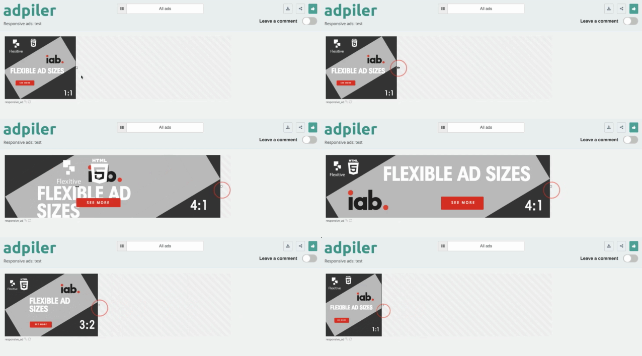
Responsive ads are presented on the preview page in the ‘Starting dimension’. The ad can easily be resized with the handlers until the ‘Maximum dimension’. Ads with responsive width will have handlers at the right, ads with responsive height will have handlers at the bottom.

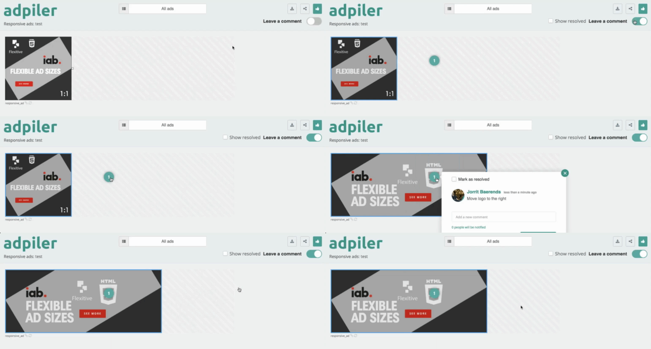
Your clients can use this interface to easily see the ads in different dimensions. They can leave a comment at any time and on any dimension. When anyone will open a comment again, the ad will automatically resize to the dimension when the comment was given. So you will have 100% clearity about the comment and elements the comment might be referring to.
“Responsive ads…? I stick to my non-responsive HTML5 or image ads…”
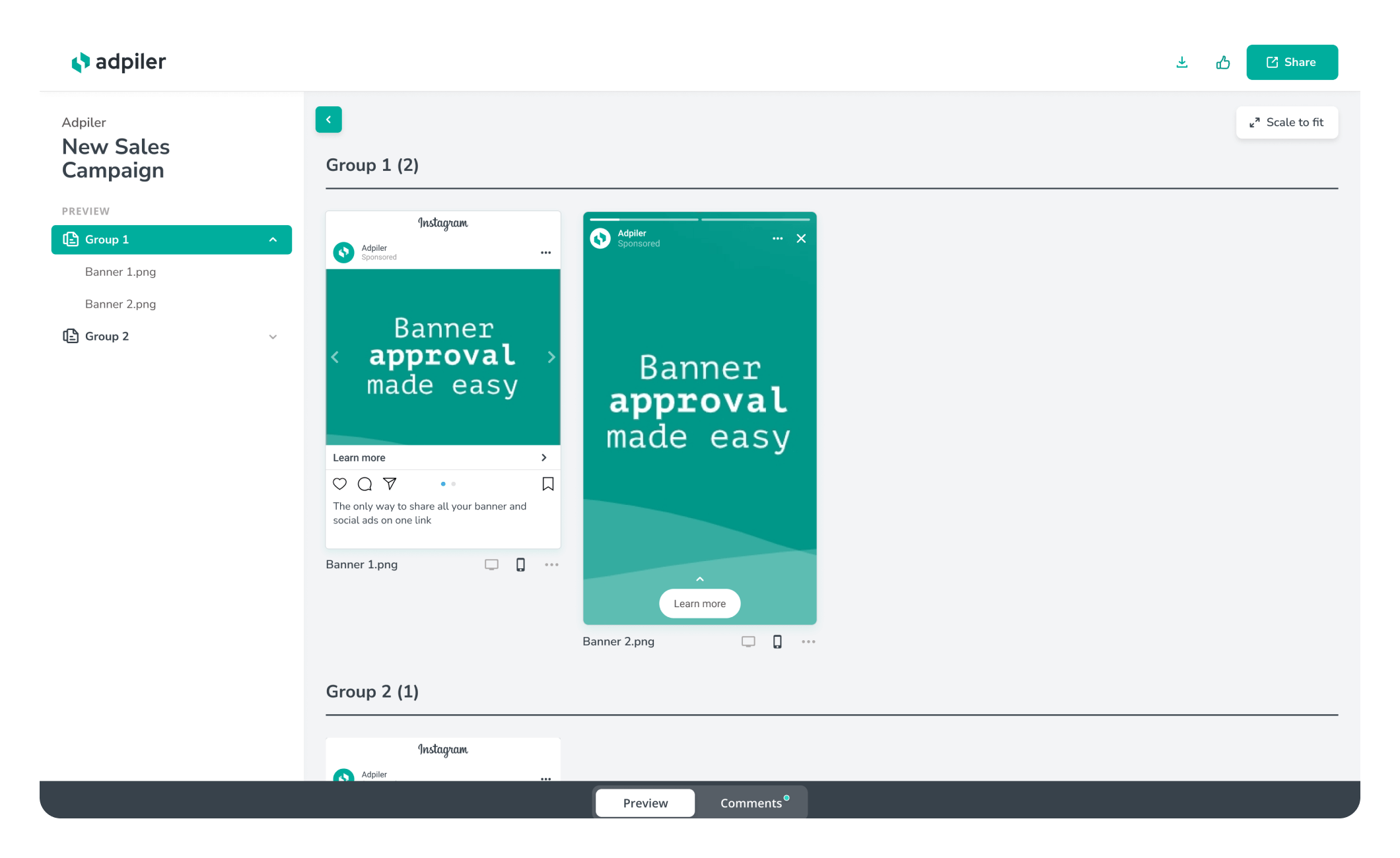
Sure, that’s totally fine and don’t worry about this change. You and your clients won’t see any difference and you can work together on Adpiler as you are both used to do.

Jorrit
Founder Adpiler

