When we launched our new website and branding, we already promised the new platform was on his way. Really happy we can now launch this new platform to all of our customers. We decided to build up the platform almost from scratch. This will give us big advantages on the technical side, so future development will be made easier. The new design of the platform will better reflect the features we have and the new UX will give our users a much better experience.
Besides the look and feel, we also have implemented some more changes. In this article, I will highlight the most important ones, although this is not a complete list.
Preview pages renamed to campaigns
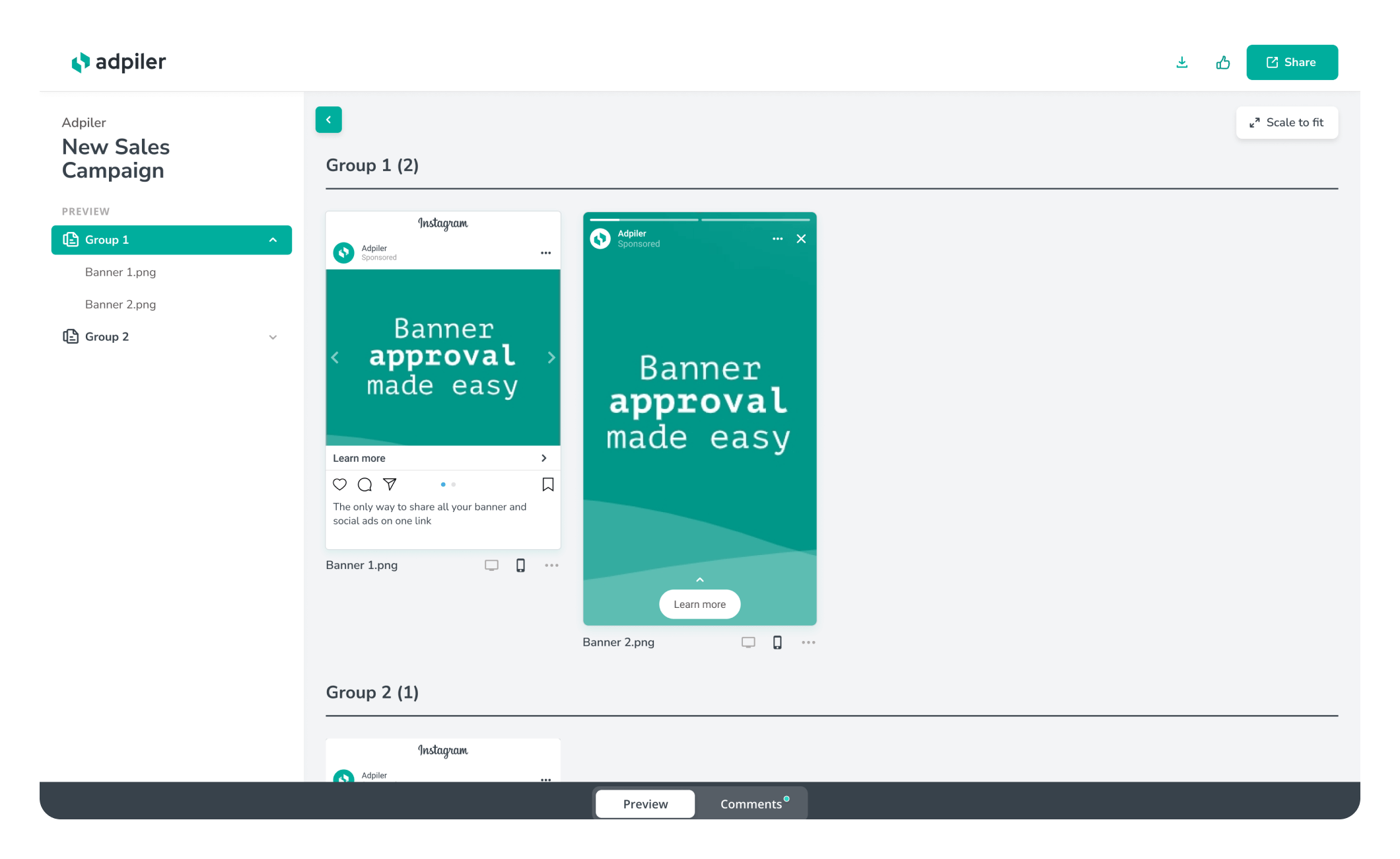
As the term ‘preview pages’ was not fully covered, the term ‘campaigns’ will better reflect the use case. The term ‘preview page’ will be used for solely the page you share with the client itself. So in terms of hierarchy: a Client can have multiple Campaigns (might be organized in folders), whereby a Campaign has a Preview page that you share with your client.
Recent activity
The Dashboard contains a table with all your clients. We have used the right sidebar to show the most recent campaigns you are working on. This will give you direct links to check the preview page, the details of the campaign, or upload new files.
Better organized UX
This will be the clearest change. We have started drawing from scratch on the UX and design. We have moved some pages, combined some pages into one, and mostly re-organized elements per page.
All pages related to account, profile, and subscription can now be found on the Account page. This gives us space to give the most attention to Client, Comments, and Upload in the main menu. There’s less space used for the menus, so more space for content where it’s all about.
New comments page
New comments on your preview pages are sent to your email but can be found on the Comments page as well. We have further simplified this Comments page. The comments link to the preview page, as communication on the file is much easier. We have made a better distinction between Unresolved and Resolved comments. This also takes away the need for working with unread and read comments. This was causing issues with multiple users, resulting in incorrect unread counters. Unresolved and Resolved comments are now leading, as this is aligned through the full account.
The new Comments page also includes bulk options to mark all comments as resolved/unresolved. The export function will help you to manage your comments in your own system or spreadsheet.
Duplicate campaigns
Sometimes you need to copy a campaign. Imagine you need first internal approval, followed by external approval. Or you need to copy just the campaign structure. Introducing the option to duplicate campaigns gives you the freedom to copy the structure or structure and files to a new campaign.
Campaign detail page
The most used page has got the newest features and improvements: the detail page for your campaign. Easy collapse groups to organize your preview page, use multi-select (hold SHIFT and click the first and last item) to quicker execute bulk-actions to your files, and we have introduced easier drag and drop to organize your files.
The right sidebar also includes a ‘Dropzone’ to quickly add your files to the campaign. Also, if you have disabled the download from the preview page, you are always able to download the files from the platform.
Share your feedback
Our team used your feedback and their own expertise to come up with this new platform. If you have any new suggestions, feedback, or applause 😉, please let us know. You can always reach out to us at hi@adpiler.com. We are looking forward to hearing from any of you.

Jorrit
Founder Adpiler


