Earlier this year we have introduced our new branding and the new Adpiler platform. Today we are happy to announce our brand new preview pages. The preview pages are the most important pages for you and your client. Your creative work, like HTML5 banners, static images, or video from the campaign, is shared on these preview pages.
The new preview pages are currently in beta. Please send us a message at support@adpiler.com if you want to join this beta program.
Like we did with our platform, we have to rebuild the new preview pages from scratch. That gave us the possibility to give all functionality we have on the preview pages their deserved position, it gave a lot of UX improvements, and we were able to include some of the most requested features. In this blog post, I will highlight the most important changes, although this is not a complete list.
For an example of the new preview page, you can check out this example.
Preview of files
- Left sidebar to give you overview
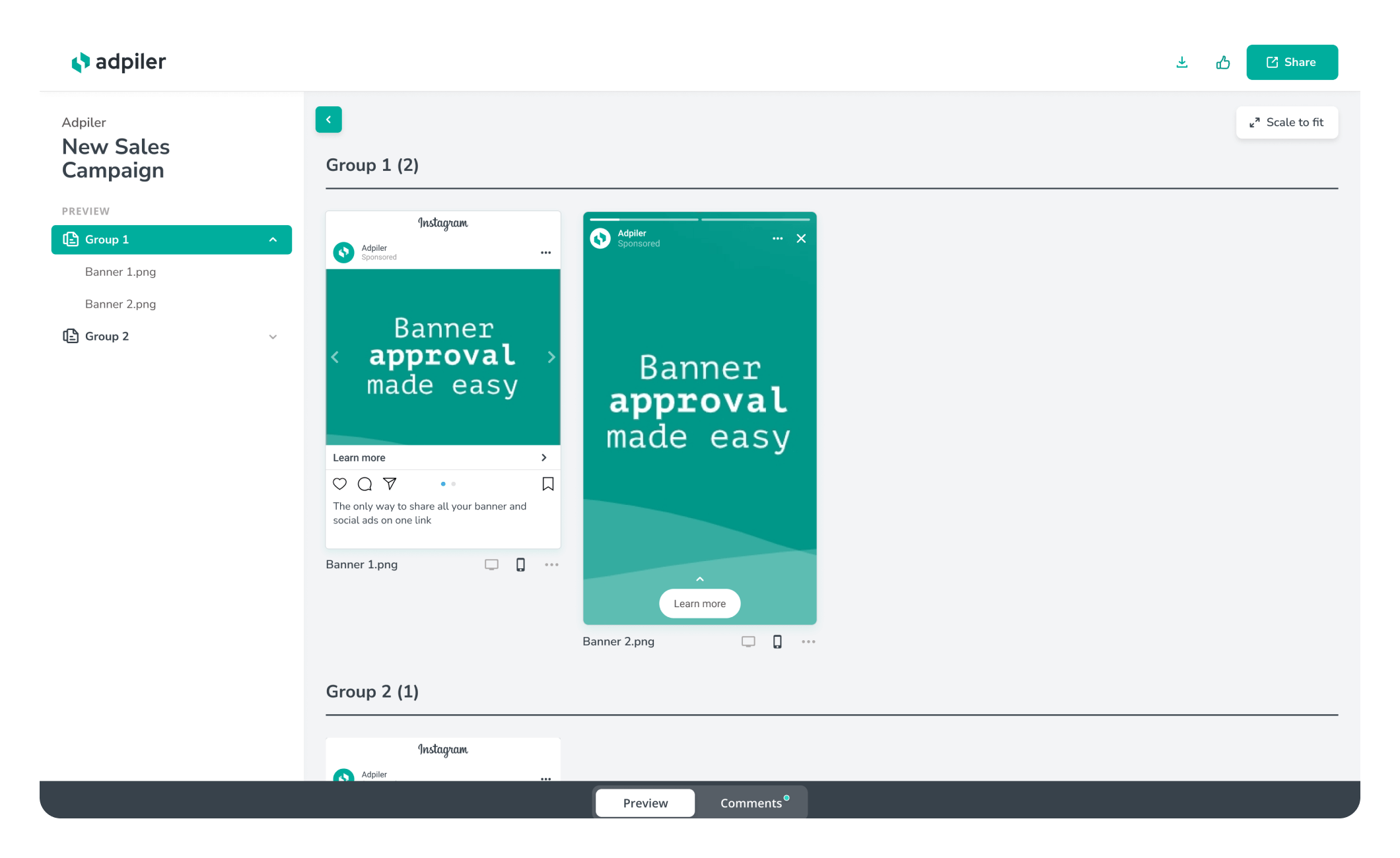
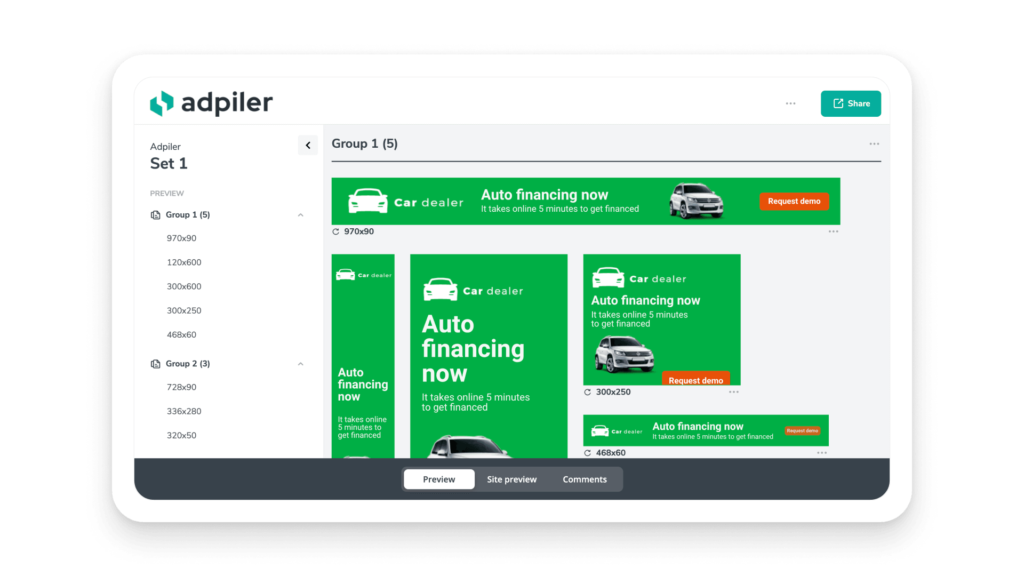
The dropdown on the top of the page is replaced by the left sidebar. Groups and files are listed clearly to get a quick overview of the content of the campaign. - Permalinks to groups
Do you want to share a link to a specific group of the page? Every group will have his unique permalink. As this was already the case for files, you can now easily share individual files and groups with your clients. - More clear approval status
The list view with files in the left sidebar will show the approval status of each individual file. Easily get to know what files are approved and what not yet. - Scale files to fit the screen
Maybe our most requested feature and very happy to announce this: Scale to fit. If the file doesn’t fit on the user’s screen, the user will see a button ‘Scale to fit’ to resize the file to fit the screen. This is useful for very large files when viewed on a desktop, or for many files when viewed on a mobile device.
Preview on websites
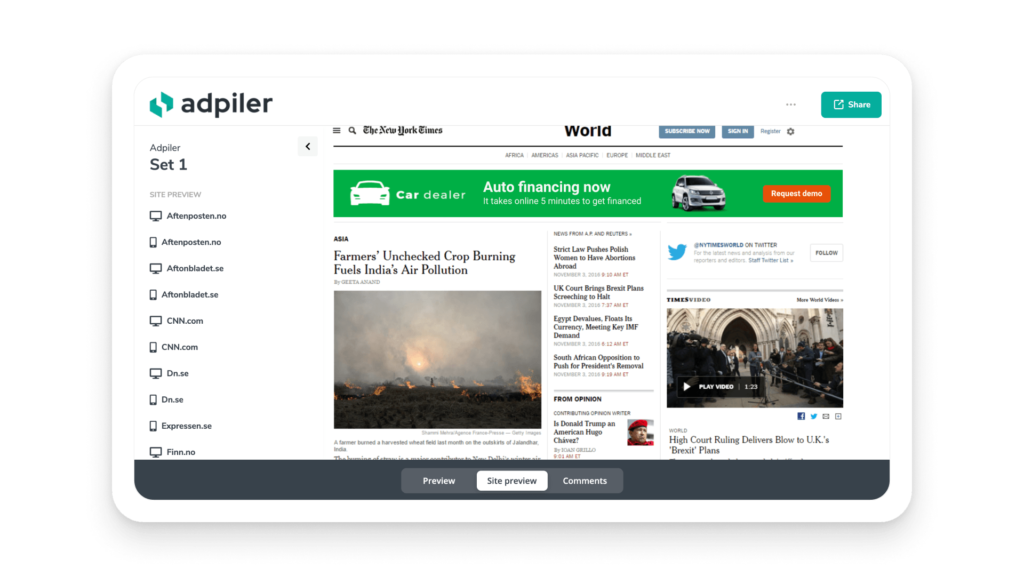
When you are uploading banner ads with the dimensions suitable for websites, you can preview them on specific websites. Here we also use the left sidebar to list the sites to preview on. Besides this, not much has changed on this part.
Comments
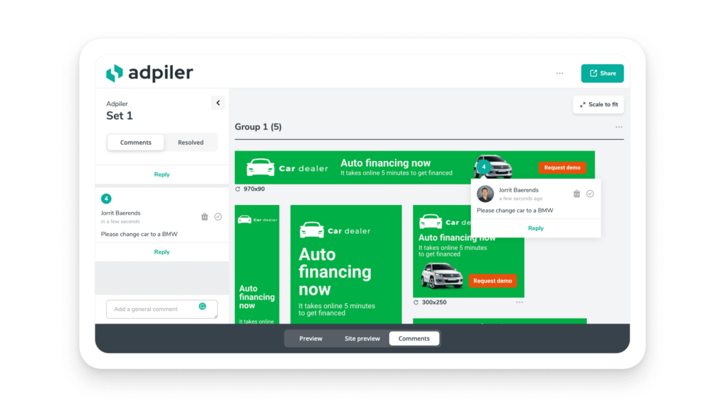
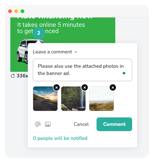
- Comments deserved their section
The preview pages used to work with a toggle to switch to comment mode. This feature worked out to be too hidden for clients. As comments are a very huge timesaver by many of our clients, we decided to create a separated section for this. By switching the tabs on the bottom menu, any user can easily switch to the comment mode. - Left sidebar to overview all comments
The left sidebar is here used to show all comments. It will give you a clear overview of all comments and you can easily switch between pending comments and already resolved comments. - Not every comment is related to a position: introducing general comments
Not all comments need to be related to a position on a file. Some comments are general and apply to all or many files. The left sidebar gives you the option to leave such a general comment. - Scale to fit works with comments
The new feature ‘Scale to fit’ is compatible with comments. So when you scale an image to fit the screen and leave a comment, that comment is correctly related to the position when it’s shown in the original size. In other words: your clients can comment on their mobile device and you will see the correct position on your desktop.
What’s next?
As you know, we continuously roll out new features and improvements. Now we have finished the new branding, new platform, and new preview pages, we will keep bringing new stuff. On the roadmap are a custom color for your preview pages and even an API is on his way.
And as always, please contact our team to share your feedback and suggestions. Together we build the best product for you.

Jorrit
Founder Adpiler
